Analyze your data
You can use Quick Chart to analyze your DMS defect data on a dashboard.
A. Go to Quick Chart and create a Retrieval
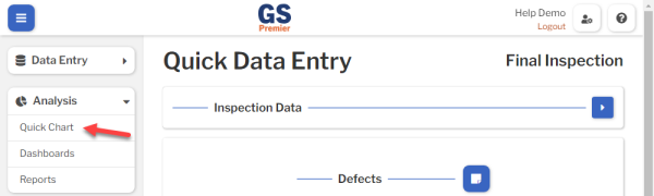
- On the navigation menu
 , expand the Analysis
  section. Then select Quick Chart.
 On the Quick Chart page, the Retrievals panel determines what data you are analyzing.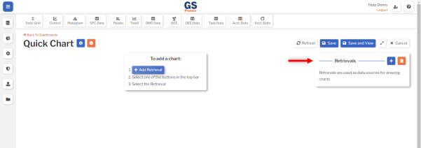
- Create a Retrieval for your data:
-
- Select the Add Retrieval button
 , or select
  on the Retrievals panel, to create a new Retrieval.
 - Create a Retrieval Name.
- It is used to build charts, but it will not be displayed on charts.
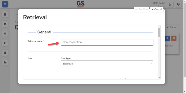
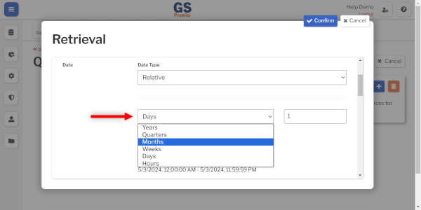
- In the Date section, set the date range you want to analyze.
- The default date range is Current Day (today).
- If you want to include any previous data:
- Choose a date increment such as Weeks, Months, and so forth.
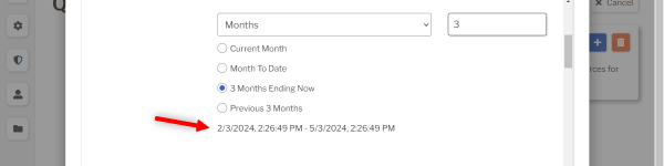
- Select the type of date range such as Current, Previous, and so forth.
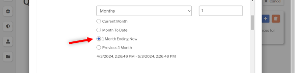
- For an option with 1, you can also change the number.
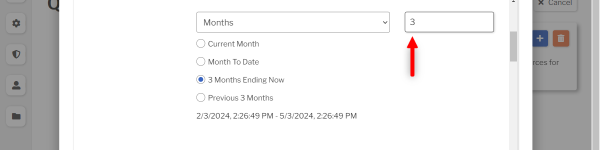
- Verify the date range.
- Choose a date increment such as Weeks, Months, and so forth.
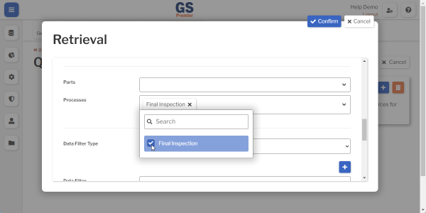
- Select the Processes list and then select your Process.
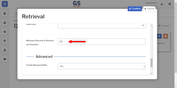
- To include more than 25 data records on the chart, set the Maximum Records to Retrieve per Standard greater than (or equal to) the number of data records you entered.
- Select Confirm to save your new Retrieval.
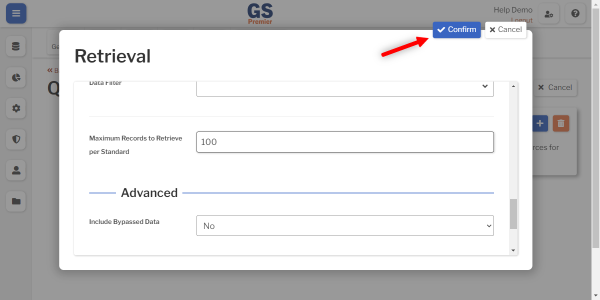

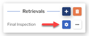
- If you need to edit this Retrieval, select its Settings button
 .
. 
- Select the Add Retrieval button
-
B. Select a Chart Type and your Retrieval
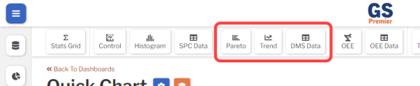
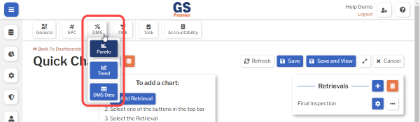
This group of buttons analyzes DMS defect data:
on a PC:
on a tablet:
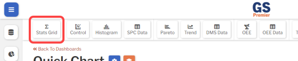
The Stats Grid button can also analyze DMS defect data:
on a PC:
on a tablet:
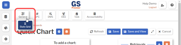
To proceed:
- Choose how to view and analyze your data:
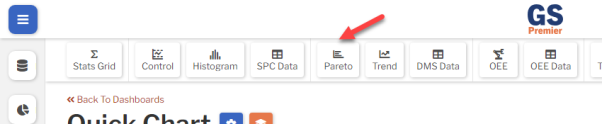
- For a Pareto Chart, select the Pareto button.
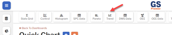
- For a Trend Chart, select the Trend button.
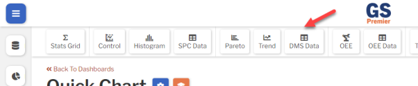
- For a Data Table, select the DMS Data button.
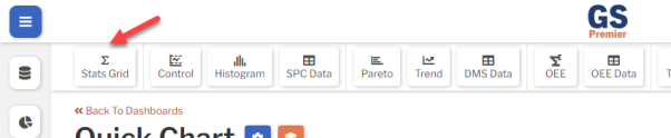
- For a Statistics Grid, select the Stats Grid button.
- For a Pareto Chart, select the Pareto button.
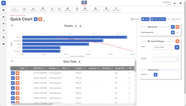
- Select the Retrieval you created.
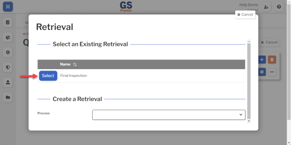
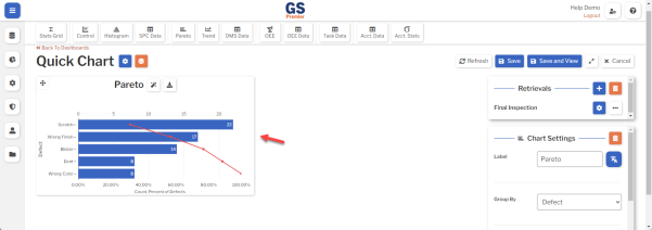
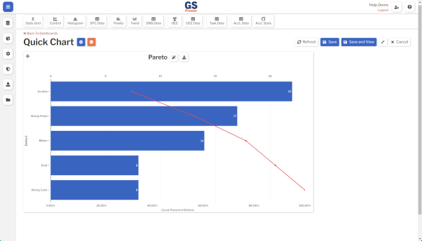
- This places a chart window on the dashboard.
C. Make the chart bigger
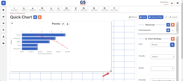
- On a PC, select and drag any edge or corner of the chart window to make it bigger.
- On a tablet, select and hold any corner of the chart window. When the grid lines are displayed, you can drag that corner to make the chart bigger.
- Your chart edges will snap to the nearest grid lines. The grid represents the full width of the dashboard.
- Select the Expand button
 to display the full-sized dashboard (without the retrieval and settings panels).
 Pro tip: If you select and drag an edge again, you can see how that same grid is applied when the dashboard is full-sized.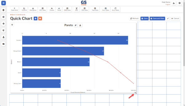
- Select the Collapse button
 to display the retrieval and settings panels again.
Congratulations  on making your first chart!
Next, we'll show you how to create more charts for the same data.
After that, we'll show you what you can do with those charts.
Analyze the same data on another chart
It's easy to add another chart of the same data:
- Select another DMS chart button.
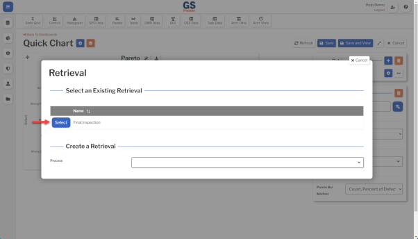
- Select your retrieval from the Select an Existing Retrieval list to analyze the same data — part number, process, characteristic, and date range — as your existing chart.
- Like before, this adds a chart window to the dashboard.
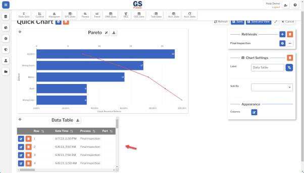
- To size this new chart window, you can:
- select and drag an edge or corner of the chart window like you did before
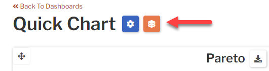
- select the Auto Tile button
 to automatically arrange all the chart windows on the dashboard
Work with charts
With one or more charts on the dashboard, you can:
- Download
 a copy of the chart.
- Look for Insights
 from your data to help you reduce defects.
 - Expand the dashboard and then use your browser to print it.
- On most PC browsers, you can press CTRL+P to print.
- On most tablet browsers, you can select the Share
 button to print.
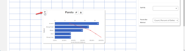
- Use the Move button to drag the chart to a different position on the dashboard.
- Add more charts to the dashboard.
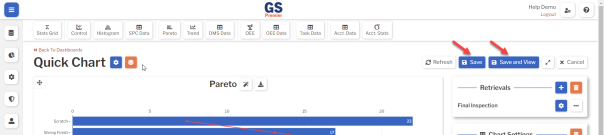
- Save the dashboard for re-use.

Some charts have special functions:
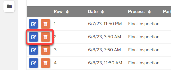
- On a Data Table, you can change or delete any row by selecting the Edit button
 or Delete button
  .
.
- On a Pareto Chart, you can change how defects are grouped into bars, find the Defect Count for each bar, find the Cumulative Percent of Defects, and Drill Down into any bar on the chart:
-
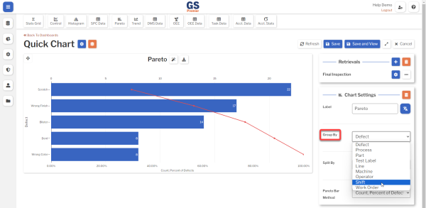
- This chart initially groups the bars by defect name, but you can change this to group defects by traceability or another category instead:
- If the Retrievals panel is not displayed, select the Collapse button .
- Select the Pareto Chart to display its Chart Settings panel.
- Select the Group By list and choose the category for grouping defects on the chart.
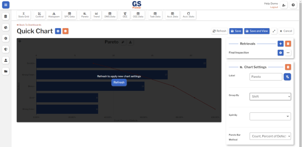
- Select the Refresh button on the chart.
- If the Retrievals panel is not displayed, select the Collapse button
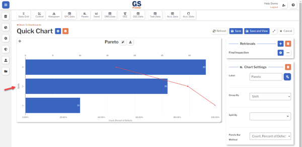
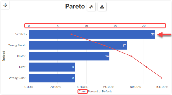
- The number on each bar shows that bar's Defect Count. This corresponds to the scale above the chart and the first label on the x-axis.
- For example, the first bar on this chart shows that 22 Scratch defects were found in your Retrieval.
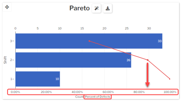
- The red point on each bar uses the bottom scale to show that bar's Cumulative Percent of Defects, which
- makes it easy to find how many of the top bars add up to 80% of all defects found — a common approach to defect management.
- For example, this chart shows that Shift 3 and Shift 2 produce over 80% of all defects found in your Retrieval.
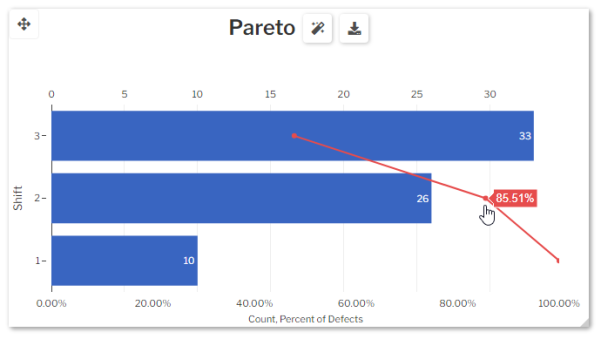
- You can also view the exact cumulative percentage.
- on a PC: Hover your mouse over the point.
- on a tablet: Select the point.
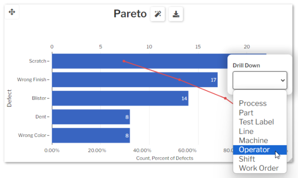
- You can select any bar and and Drill Down to analyze its defects by another category.
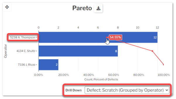
- For example, selecting the top bar (Scratch) and drilling down by Operator shows that 5238 A. Thompson produced over 50% of the Scratches found in your Retrieval.
- This chart initially groups the bars by defect name, but you can change this to group defects by traceability or another category instead:
-
- On a Trend Chart, you can change how defects are grouped by time, choose a different type of trend plot, set the chart title, view details for each point on the chart, and interact with the chart:
-
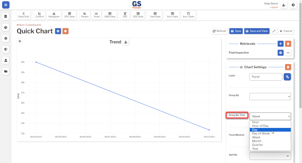
- This chart initially groups the defect counts by Week, but you can change this to group by a different time period:
- If the Retrievals panel is not displayed, select the Collapse button .
- Select the Trend Chart to display its Chart Settings panel.
- In the Chart Settings panel, select the Group By Time list and choose a time period.
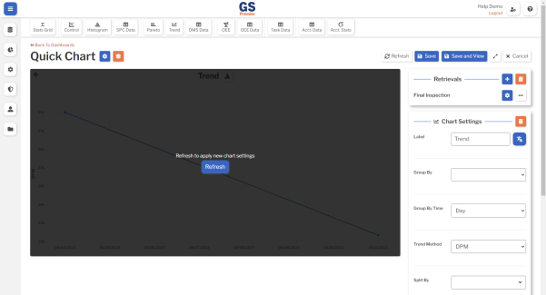
- Select the Refresh button on the chart.
- If the Retrievals panel is not displayed, select the Collapse button
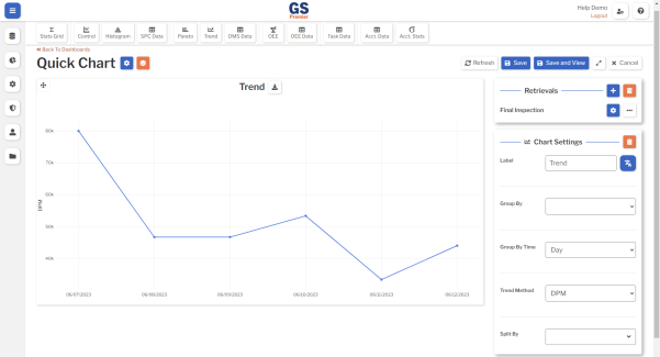
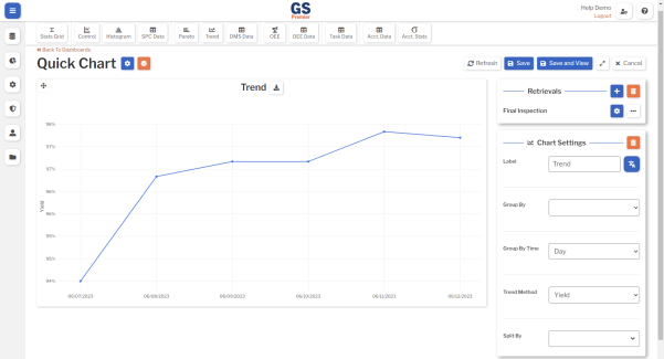
- This chart initially plots the number of Defects Per Million parts produced (DPM), but you can change this to plot other data trends:
- If the Retrievals panel is not displayed, select the Collapse button .
- Select the Trend Chart to display its Chart Settings panel.
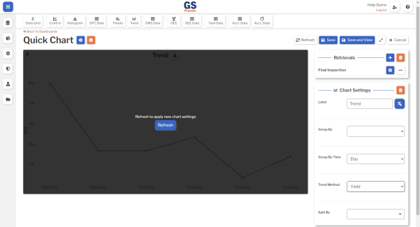
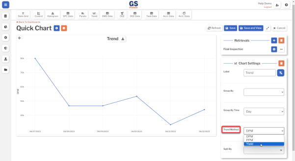
- In the Chart Settings panel, select the Trend Method list and choose a different type of trend plot.
- DPM plots the number of Defects Per Million parts produced.
- PPM plots the number of Defective Parts Per Million parts produced.
- Yield plots the Good Parts produced as a percentage of Total Parts produced.
- Select the Refresh button.
- If the Retrievals panel is not displayed, select the Collapse button
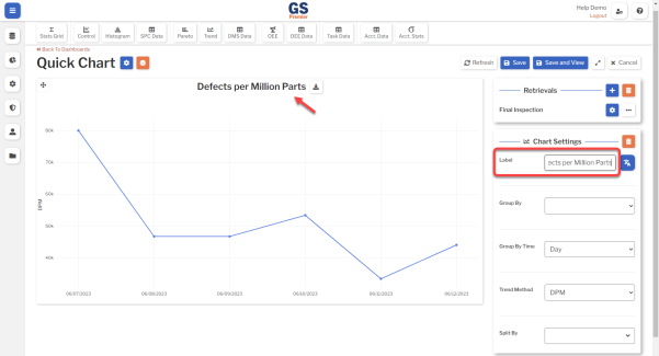
- You can change the chart title to explain what the plot points represent:
- If the Retrievals panel is not displayed, select the Collapse button .
- Select the Trend Chart to display its Chart Settings panel.
- In the Chart Settings panel, change the Label.
- If the Retrievals panel is not displayed, select the Collapse button
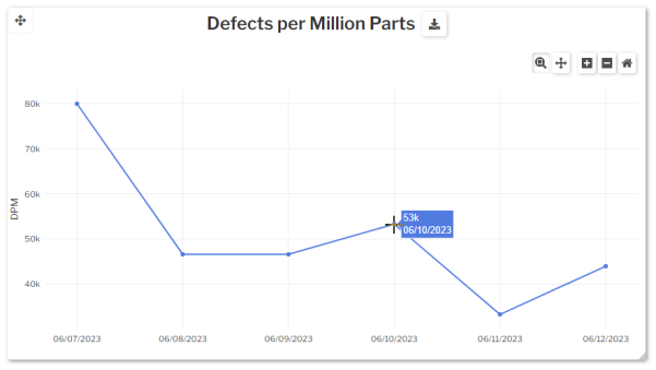
- You can view details for each point on the chart.
-
- on a PC: Hover your mouse over the data point.
- on a tablet: Select the data point.
-
- Use the chart buttons to zoom and select, pan, zoom in, zoom out, and reset the chart.
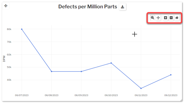
- on a PC: Hover your mouse over the chart to display these buttons.
- on a tablet: These buttons are always displayed.
- This chart initially groups the defect counts by Week, but you can change this to group by a different time period:
-