Chart Test
This lets you display charts for the data being entered on the sub-inspection.
Data Retrieved for Charts
Each Chart Test is linked to a Data Test on the Sub-Inspection.
For each Data Test, GS will chart up to the most recent 25 records with:
- A Date Time no older than one year.
- A Location that is linked to the logged-in User.
- (OEE, DMS, or Task chart): The same Process that is used to enter data for the linked Data Test.
- (Task chart): A Description that matches the Task Test's Text to Store.
- (If a Traceability is set to Filter Data Entry Real Time Checks and Charts): The Traceability value that is used to enter data for the linked Data Test, if this Traceability value is not blank.
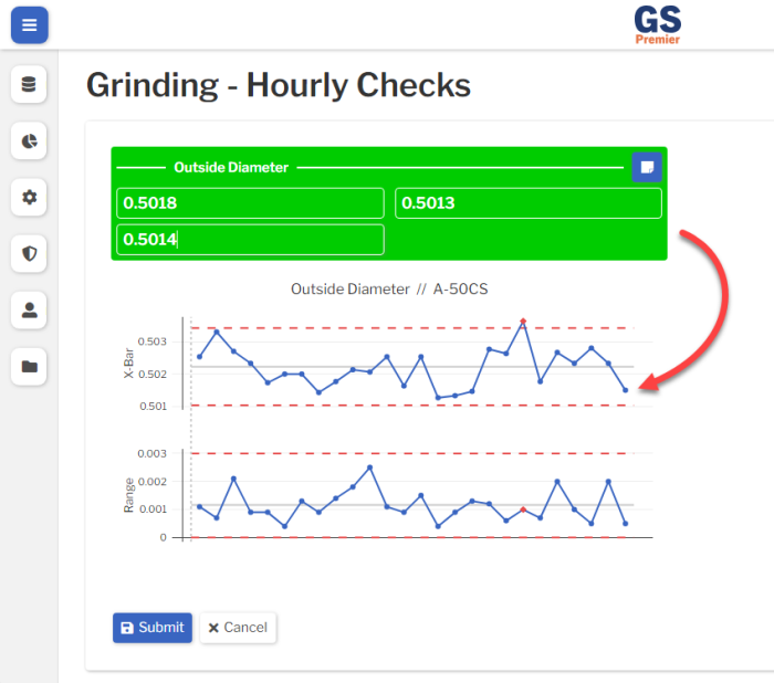
![]() While editing your Inspection Revision with a Chart Test, GS only displays a placeholder for that type of chart. When you Save and Run the Inspection Revision, GS will display your actual data on the chart.
While editing your Inspection Revision with a Chart Test, GS only displays a placeholder for that type of chart. When you Save and Run the Inspection Revision, GS will display your actual data on the chart.
Test Settings
Label
The label displayed above this Test.
You can translate this into another language (Spanish or English).
Visible
When this Test is not Visible, it will not be displayed to the data entry inspector.
Script ID
This is used by Inspection Scripts to identify this Test.
Data Type
Choose the type of data you want to chart: SPC, DMS, OEE, or Task.
This should correspond to one or more Data Tests on the Sub-Inspection.
Chart Type
Choose the type of chart you want to display.
Your options will vary based on the selected Data Type (above).
Linked Tests
Select one or more Data Tests to chart, based on the selected Data Type (above).
- If the Data Type is SPC, each Linked Test will be analyzed on a separate chart.
- If the Data Type is DMS, OEE, or Task, all Linked Tests will be analyzed together on the same chart.
Chart settings
The Chart settings depend on the Chart Type you selected (above).
Control Chart
- Group By :
- You can set up the chart to Group data by Traceability, Anchor Point, or other categories.
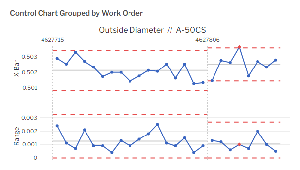
- If your chart displays Dynamic Control Limits, your Grouped chart will recalculate the Mean and Control Limits for each Group.
- This makes it easy to see differences in the average measurement (the Mean) and the variation (width of Control Limits) between Groups.
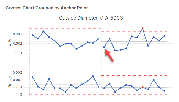
- For example, in the chart shown above, the second Work Order has a higher data mean and less variation than the first Work Order.
-
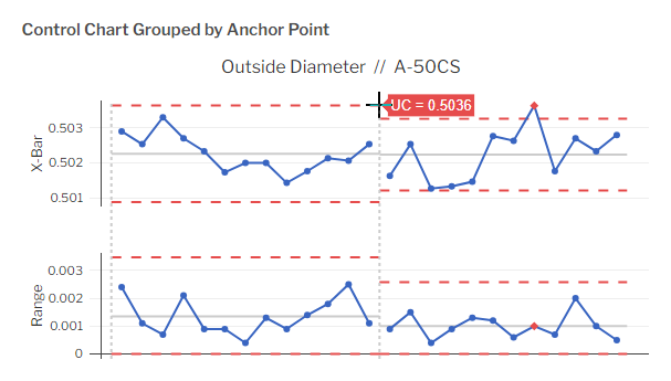
- An Anchor Point is typically used to mark an engineering change. You can edit a subgroup to mark it as an Anchor Point or use an Inspection Script to do so during data entry.
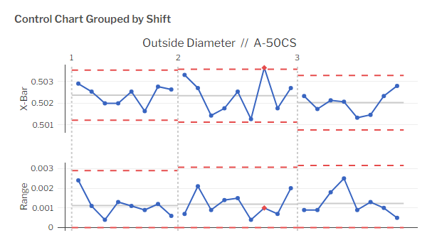
- When Grouping by Traceability, Test Label, or Location, GS will first create the Groups and then put the data into chronological order within each Group.
- This means that the first data point in a Group might have an earlier Date Time than the last data point in the previous Group. However, all of the data within each Group is ordered by Date Time.
- In this example of a chart that is Grouped by Shift, the last point in the Shift 1 Group might be later than the first point in the Shift 2 Group.
-
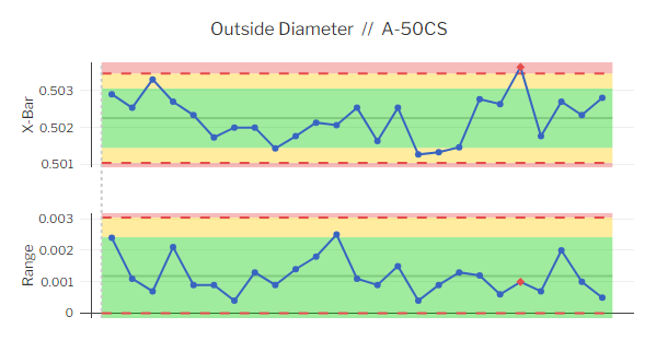
- To see the value of a Group control limit or Mean:
- on a PC: Hover your mouse over the end of the line.
- on a tablet: Select the end of the line.
- To see the value of a Group control limit or Mean:
- These Group Control Limits do not affect the Control Limits or Mean used to check for Real Time Failures.
- An Anchor Point is typically used to mark an engineering change. You can edit a subgroup to mark it as an Anchor Point or use an Inspection Script to do so during data entry.
- Show Specs :
- Choose whether or not to display Specification Limits on the Chart.
 Best practice is to turn this off, as displaying Specification limits can encourage tampering with the process and can distract from the goal of keeping your process in Control.
- Show Individual Limits :
- Choose whether or not to display Individual Limits on the chart.
- Show Control Limits :
- Choose which Control Limits to display on the chart, if any.
- The default for this setting is based on the Global Setting for Fixed or Dynamic Limits.
- Dynamic uses the data retrieved for the chart to calculate the Control Limits and their midpoints.
- Fixed uses the Characteristic's Fixed Upper and Lower Control Limits, X Target (or the midpoint between limits if X Target is blank), and R Target (or the midpoint between limits if R Target is blank) to display the Control Limits and their midpoints.
- Show Range :
- Choose whether or not to display the Range chart.
- Show Zone Colors :
- GS can display a green Zone for the inner 2/3 of the area between the Mean and a Limit, a yellow Zone for the outer 1/3 of that area, and a red Zone outside the Limits.
- You can choose whether to base these Zones on the Control Limits or on the Specification Limits.
Pareto Chart
- Group By :
- You can choose how the bars are sorted — by Defect name, Traceability, or another category.
- Pareto Bar Method :
- This determines which values are analyzed and how they are presented on the chart:
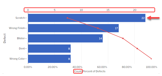
- Count, Percent of Defects (the default method) :
-
-
- The number on each bar shows that bar's Defect Count. This corresponds to the scale above the chart and the first label on the x-axis.
- For example, the first bar on this chart shows that 22 Scratch defects were found in your Retrieval.
-
-
-
- The red point on each bar uses the bottom scale to show that bar's Cumulative Percent of Defects, which makes it easy to find how many of the top bars add up to 80% of all defects found — a common approach to defect management.
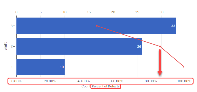
- For example, this chart shows that Shift 3 and Shift 2 produce over 80% of all defects found in your Retrieval.
-
-
- Count, Percent of Sample Size :
-
- The number on each bar shows that bar's Defect Count. This corresponds to the scale above the chart and the first label on the x-axis.
- The red point on each bar uses the bottom scale to show that bar's Cumulative Percent of Sample Size (the total Sample Size for all the items inspected).
-
- Cost, Percent of Defects Cost :
-
- The number on each bar shows that bar's Defect Cost. This corresponds to the scale above the chart and the first label on the x-axis.
- The red point on each bar uses the bottom scale to show that bar's Cumulative Percent of Defect Cost (the total cost for all of the Defects found, based on the NCU Cost of the Defects).
-
- Cost, Percent of Total Cost :
-
- The number on each bar shows that bar's Defect Cost. This corresponds to the scale above the chart and the first label on the x-axis.
- The red point on each bar uses the bottom scale to show that bar's Cumulative Percent of Total Cost (the total cost for all of the Nonconforming Units found, based on the NCU Cost of the Process).
-
- PPM :
-
- The number on each bar shows that bar's PPM ((Sum of Nonconforming Units / total Sample Size for all the items inspected) * 1 million). This corresponds to the scale above the chart.
- The red point on each bar uses the bottom scale to show that bar's Cumulative Percent of Sample Size (the total Sample Size for all the items inspected).
- This chart will display an error if Group By is set to Defect.
-
- DPM :
-
- The number on each bar shows that bar's DPM ((Sum of Defects / total Sample Size for all the items inspected) * 1 million). This corresponds to the scale above the chart.
-
- Cost per Unit :
-
- The number on each bar shows that bar's Cost per Unit (based on the NCU Cost of each Defect, the count of each Defect found, and the total Sample Size for all the items inspected). This corresponds to the scale above the chart and the first label on the x-axis.
-
- Sigma :
-
- The number on each bar shows that bar's Defect Sigma Level (calculated from the Sum of Defects and the total Sample Size for all the items inspected). This corresponds to the scale above the chart.
-
- Count, Percent of Defects (the default method) :
- This determines which values are analyzed and how they are presented on the chart:
OEE Chart
- Group By (optional) :
- You can calculate OEE separately for each Process, Part, Traceability, etc. that was found in the data.
- Group By Time (optional) :
- When left blank, GS will display a bar chart of each OEE Factor you select (below).
- If you select a time period for this setting, GS will display a line chart of the OEE Factor over time.
- OEE Factors :
- Select one or more OEE factors to chart — Availability, Performance, Quality, and OEE.
- A separate chart will be displayed for each factor you select.
Data Table
- Columns :
- You can customize which columns are shown on the Data Table, and in what order.
Border
Add borders to the edges of this Test.
Freeze Test
If this Test is placed on the same row as a longer Test, it will not scroll off the screen until the longer Test scrolls off the screen.
Interacting with charts
The data entry inspector can interact with Chart tests. Their options will depend on their User Role.
Control Chart
- You can view more information about any data point or limit line on a Control chart.
-
- on a PC: Hover your mouse over the data point or the end of the limit line.
- on a tablet: Select the data point or the end of the limit line.
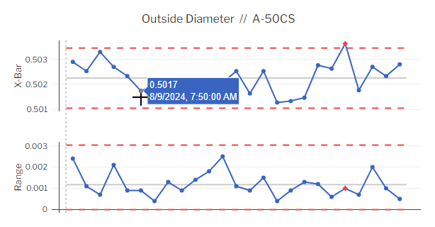
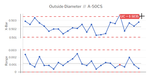
-
- (on a PC only): If logged in with a User Role that has permission to edit data — such as a Supervisor, Engineer, or Administrator — you can edit a data point by clicking on it.
Pareto Chart
You can Drill into any Pareto bar to analyze potential sources of Defects.
In this example, the user clicks the top bar (Dent defects) to drill down by Shift.
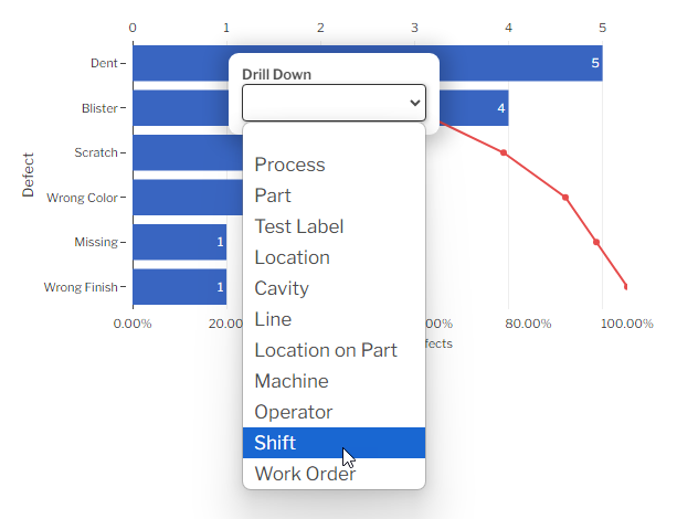
Shift 2 (the top bar of the Drill Down chart) shows the greatest number of Dent defects.
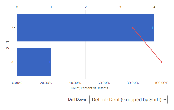
You can continue to Drill Down into Pareto bars, or you can select the Drill Down legend to return to a previous level of analysis.
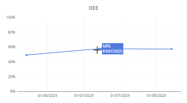
OEE Chart
You can view more information about any data point or bar on an OEE chart.
- on a PC: Hover your mouse over the data point or bar.
- on a tablet: Select the data point or bar.
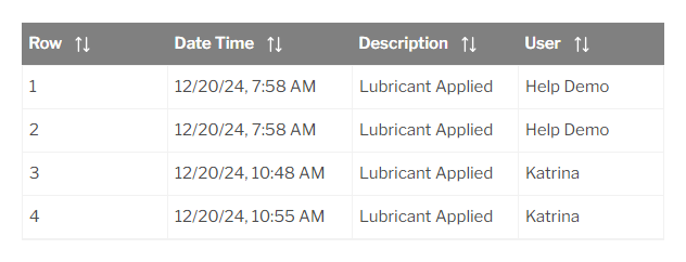
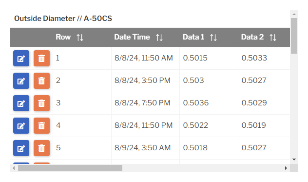
Data Table
- You can select any column header to sort the rows in ascending order by that column. Select it again to sort the rows in descending order.
- If logged in with a User Role that has permission to edit or delete data — such as a Supervisor, Engineer, or Administrator — you can select the Edit button
 or Delete button
  to edit or delete an SPC, DMS, or OEE data record. (Task data cannot be edited or deleted.)
Translating text into another language
To translate a text field into another language (Spanish or English), select its Translate ![]() button.
button.
![]()
Enter your translated text, then select the Save button at the top or bottom of the window.
![]()
For more information on translating text fields and changing the language displayed to the user, see Custom Translations.